7 tips for using blue in the interior + photo
Have you noticed how, at certain points in your life, you suddenly suddenly start to like a certain color, and you begin to actively use it wherever possible? You buy clothes of certain colors, think about whether to paste wallpaper in the bedroom, and especially brave personalities can even dye individual strands of hair in an unusual color. All this is the result of our moral and energy exhaustion and, as you know, many colors highly beneficial effect on the human body and even have therapeutic properties. Thus, the body tries to make up for losses and recover. Today we will consider one of the most auspicious colors – blue and give you some application tips blue in the interior of various rooms.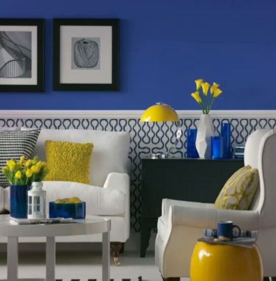
1. How does blue color affect the human body?
Any color It hasyour meaning ignoring which is undesirable, especially if you are going to use it in the interior of your apartment. As known, repair is done not for a year or two, but for a longer period, so the choice of color must be approached very thoughtfully, because this is one of components of a successful repair. What about blue? Start with positive sides. This color is associated with an endless sky and deep ocean, admiring the waves of which, many find peace and tranquility. In moderation, it is able to give feeling of serenity and when using it in decoration. This color is the most easy to read our body. In ancient times it was considered a symbol of wisdom stability, spiritual principle and spiritual strength, which is why many church arches are painted with shades of blue. And on many icons the deities are dressed in blue and blue robes. Longtime healers They knew how to help troubled people find moral peace, using a small amount of exactly blue.
There are also negative sides. But they relate mainly to its too dark and deep shades, which in large quantities can cause aggression, fear and depression blunt activity and desire for action. This is because, at a subconscious level, our brain perceives these shades as a threat, because they are very similar to the deep, cold and hectic sea depths. Light tones carry positive and carefree emotions. Remember the expression "Blue dream" which implies something distant and unrealizable? That's how our body perceives blue shades - easy and at ease.
Intense blue - indigo, is considered a symbol of high intellectual development, deep knowledge and talent. No wonder gifted genius children are called "Indigo children". And only the dark blue color is unfavorable and is associated in many peoples with dark demons. As for people, whose favorite color is blue. In most cases, they are introverts who like to spend time in silence and calm, analyzing their own thoughts. From here appears secrecy and isolation in relation to other people. Many will find such individuals strange, but in fact, they possess not weak mental and analytical abilities and often reach heights in science.
2. Combine the colors correctly
Of course, it’s worth strictly control ratio primary and secondary colors, to achieve harmony and the right balance. To do this, it is worth deciding which shades the most successfully combined color of your choice.
there is standard and win-win schemes, which guarantee an optimal result. For example, absolutely any colour the best way combined with shades of white or pastel colors. Due to their neutrality, they smooth out possible negative manifestations, create smooth transitions and soothe saturated and aggressive colors. To make such an interior more voluminous and interesting, for emphasis you can use the colors a little more saturated and darker for a couple of tones than the complementary color. Thus, you do not overdo it with the number of shades, which ideally there should be no more than three, and use your favorite blue and its colors in a dosed manner. These color combinations are great for marine interiors and are appropriate in any room. Everything is clear with this scheme, it really works and gives the desired result, but there are also more interesting and extraordinary combinations of blue that many of you will like. 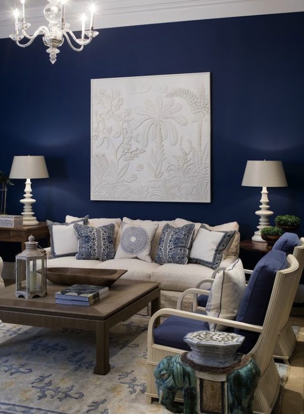
- Blue + green. This pair is neighbors in the color palette, therefore it is able to complement each other very harmoniously. Interiors in such a color scheme is very positively affect per person. They do not tire and do not irritate, provide the opportunity for a good rest, soothe and relax, can not quickly get bored or go out of fashion and are universal for both men and women at any age. Room right away becomes more fresh and cool. You can use both bright and muted shades. It all depends on your preference. It will be successful to use this pair on a neutral background.

- Blue + Orange or yellow. It can be said that this is one of the most unexpected but at the same time, very successful combinations. In this case, do not use bright shades of orange, as they will tire your eyesight, but muted shades will create a real tropical interior. Good shades for combination there will be peach, pumpkin, amber or salmon. But blue, on the contrary, should remain bright so as not to get lost, perhaps even bright blue. Tandem with in yellow was very fashionable several years ago, but gradually forgot about him, but in vain. These rooms look very interesting and cozy. The main thing is to choose shades of the same temperature. Cold blue combined with a pale but warm shade of yellow will create a very sharp and unpleasant transition. But light yellow + cornflower blue will successfully emphasize the interior in rustic style.
- Blue + gold or silver. Highly stylish combination which requires compliance clear proportions and mandatory dilution with pastel shades. Gold or silver is allowed to be used only as accents in the form of decor items, picture frames or small pillows. The interior will be a bit cosmic, but very sophisticated.
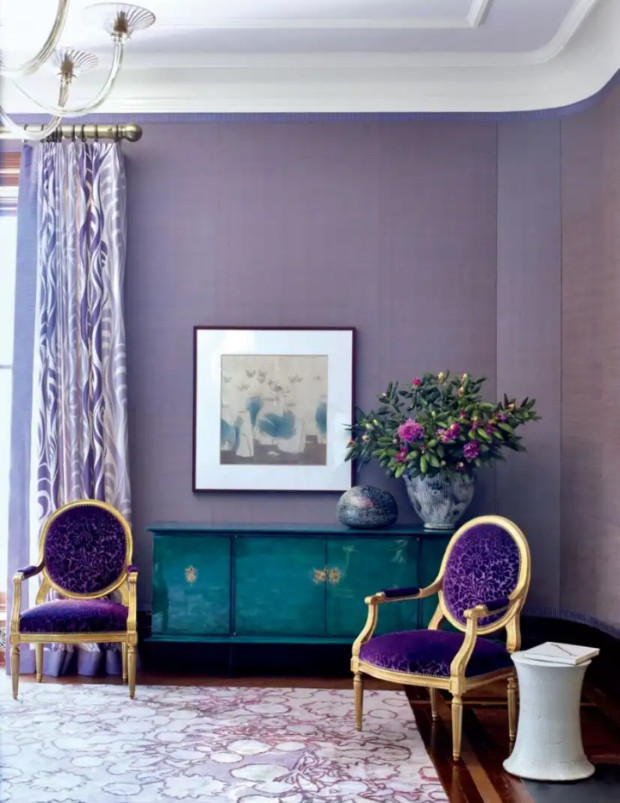
- Blue + purple. These colors are very close in the color spectrum and complement each other very harmoniously. But for some reason, such a union use highly seldom. Therefore, if you want to create really unique interior then this is exactly what you need! Composition will be very luxurious and rich. Deep ones look especially good saturated shades of purple - cobalt and amethyst. It is advisable to use them as accents, blue as the complementary color, and pastel colors as the main ones. This is due to the fact that the excess of violet depressing effect on the psyche.
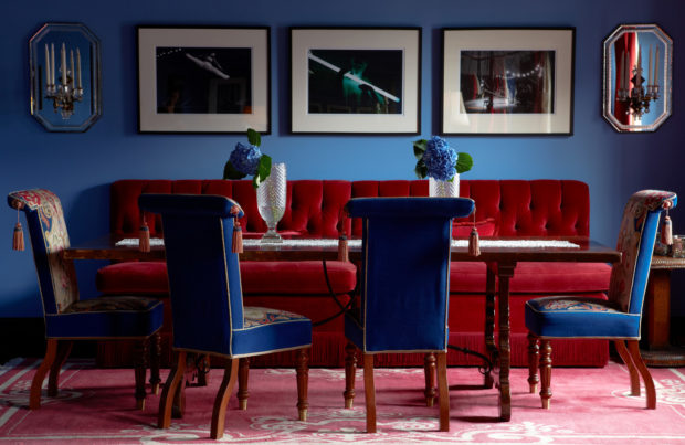
- Blue + red – not the most successful combination for rest rooms. This is because this couple contributes to enhancing mental activity. But for a small office or room for classes with a child - this is a great option. In the latter case, the shades should be muted, and there should be very little red. Small accents to help to focus on the right items, will benefit.
 Tandem with in yellow was very fashionable several years ago, but gradually forgot about him, but in vain. These rooms look very interesting and cozy. The main thing is to choose shades of the same temperature. Cold blue combined with a pale but warm shade of yellow will create a very sharp and unpleasant transition. But light yellow + cornflower blue will successfully emphasize the interior in rustic style.
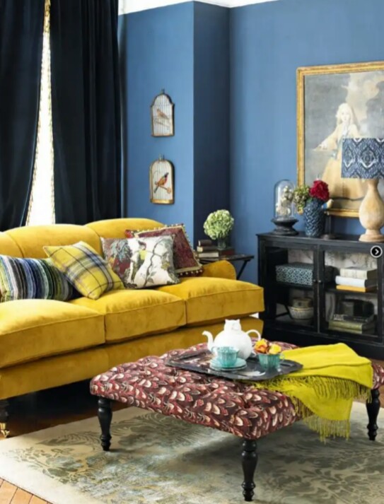
It is also worth noting the most unwanted combination – blue + the black. Yes, these two colors look together quite appropriate, but from the point of view of the impact on the psyche, they carry negative points. Such the interior is depressing there are attacks of aggression, there is a breakdown and lack of interest in any action. Especially worth avoiding this combination is melancholy. If nevertheless you really like this union, then it is necessary provide plenty of light the shade of which should not be cold, but warm yellow. This will help smooth out the depressing effect of black.
Little secret - you should consider which side your windows face. Blue refers to cold shades, and in this regard, it is able to refresh and give coolness to hot rooms, while for northern apartments it is not the most successful option. As well as for small and dark rooms.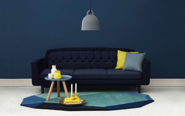
3. Blue in the bedroom interior
You can safely say that shades of blue are best option for the design of the bedroom. Moreover, it is suitable for both the rest room of a married couple, and for each family member individually. No other color can give you so full feeling of calm and good rest. You can quickly relax and fall asleep, but good sleep is pledge your his health.
If you have a sunny side and the room is sometimes too hot, then in order not to enhance this effect, choose cold tones. In such a room you will be comfortable and even fresh. Too dark shades not desirable in this room, but may be present in small quantities as decorative elements.
If your the room is small, then painting one of the walls, preferably the narrowest one, in blue, you can give the premises depths and visually expand the space. It looks very good at the headboard the beds, especially if a white bed is installed on its background. At all combination several shades of blue with white well suited for the bedroom and is real salvation for narrow and small rooms. In this case floors must be neutral in colorat. 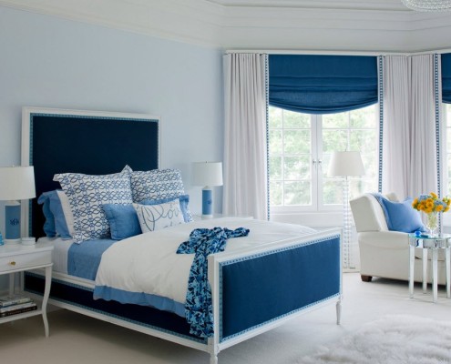 Wall surface does not have to be solid, use is encouraged striped prints and floral ornaments. Especially on textiles. If you are closer to pale and muted shades, then you can use them to finish all the walls, but in this case curtains, carpetif any, and other textile elements should be light pastel shades. In such an interior, any of the colors listed in paragraph 2 may be used as an accent.
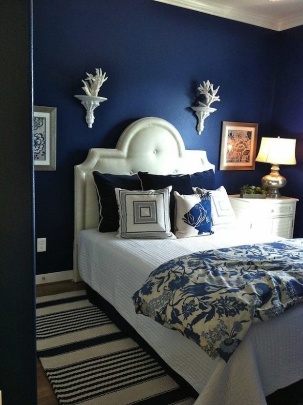
4. Noble living room
In this room you can already afford more interesting options use blue shades. Even with the most modest spending on decor items, you can do interior very dynamic and modern. Saturated blue with dark wood surfaces. And to give contrast and separate the walls and floor, use white wide baseboard. Such an element needs support, and therefore door leafs, and platbands should also be white. And as an accent, you can use floor lamps with bright lampshades red, violet or green shades.
To create a feeling of spaciousness do not clutter every empty place with objects of furnitureotherwise, in such a room, and even with blue walls, it will even be difficult to breathe. By the way, saturated blue walls will serve great background for your favorite paintings or portrait black and white photographs in white frames. 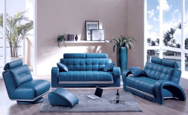 Do not forget that blue can be not only familiar surfaces, but also cushioned furniture. Luxurious blue sofa, which will take its place of honor against a light wall, will zest the whole room. Pillows can be of any color, but it is better that it resonates with curtain color or other decorative elements. Navy blue carpet combined with lighter walls will create a cozy and slightly mysterious atmosphere. And if your living room smoothly goes into the hall and has impressive dimensions, then you can use furniture in dark chocolate colors. Such an interior looks very noble and solid.
Dark tones suggest enough light both daytime and artificial. Take the trouble to ensure this condition, and then you will be able to avoid the feeling of pressure walls. For small living rooms A great option would be to use blue as a small accent, but you can use a darker and more saturated palette. Pale blue combined with creamy color will create harmonious composition which is successfully complemented by large floor vases of cobalt shades or a chic arched floor lamp with a metal chrome leg and a dark blue lampshade. Silver candlesticks or chandelier with pendants. Such an interior will be a little cool, but very stylish.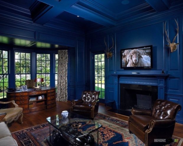
5. A good solution for children
If your the child is too active can not calm down for a long time before going to bed, and then throughout for behaves uneasy and anxious, then help calm the psyche of children and you can relax it a bit by using the blue color in the interior of the children's room.
Power saturation this color will be depend from age baby. For very young hosts, pale shades will become more suitable, perhaps even closer to blue. And so, as a child grows up, colors can be more vibrant. To paint all the walls or one - it's up to you.
Naturally, if premise small, then the bright blue walls will make it even smaller. In this case, use muted shades. If you decide that there will be only one such wall, then it is useful to know a little trick. If the child has trouble sleeping or is often tormented by nightmares, then select the wall that is side of the bed. Or the one that the child most often looks at before bedtime. Indeed, the contemplation of this color calms. If there are difficulties with concentration and perseverance when doing lessons, then blue should be wall in front of a desk. Then you should not completely load it with bookshelves, there should be free space on it.
If you like more unusual options, for example, you want blue bed or other piece of furniture, then remember that painted blue they will seem larger and heavier. And of course, the interior of the nursery in the marine style that many people love is simply unthinkable without the use of this color. Complete composition it is possible by depicting a boat on one of the walls, and decorating it with real sails or a life buoy. And next to the bed, you can imitate the hold of the cabin. The little captain will be delighted with such a room.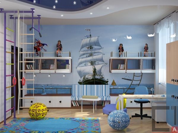
6. Blue color in the interior of the kitchen
The use of blue in the interior of the kitchen in a positive way affects on the health person. This theory has been proven. scientists of many countries. The fact is that the blue dining room interior promotes moderate appetite and reduces cravings for sweets. Therefore, if you want to start eating right, but you can’t do without at least a little candy every day, then this is your option. Very interesting and modern look blue matte facades in combination with aluminum handles and translucent glass. Add gray to the composition. countertop and household appliances with stainless steel elements, and trendy kitchen interior ready! True, this room will be a little cold. 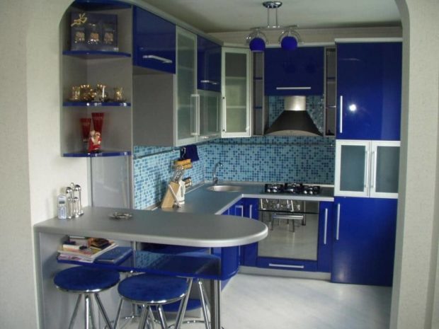 But the combination dark wooden facades and countertops dining table with blue apron and kitchen corner will be more comfortable and warm. Walls and floor will have to stay neutral shades so as not to draw attention to yourself. White wallpaper, tile or just paint will make the interior more fresh. And beige, sand or caramel shades - more warm and homely.
Reverse option the use of blue implies the placement of light furniture on a background of blue walls. In this case, you can afford the blue curtains or lamp shades. Within small kitchens It is not recommended to lay blue tiles on the floor. The floor will appear cold and the room elongated. The perfect complement to the blue headset there will be a checkerboard floor finish. Black and white masonry will help create the necessary contrast.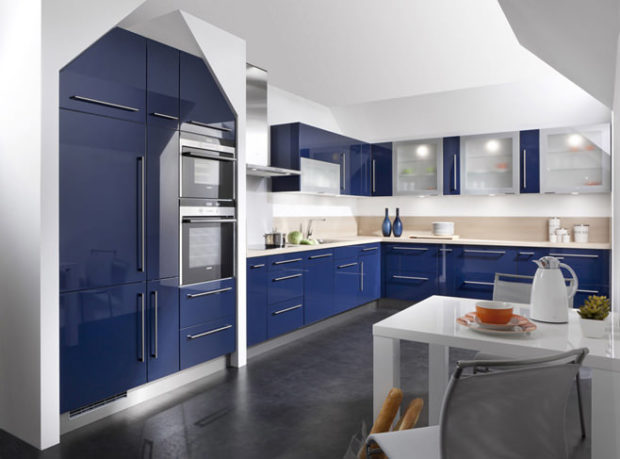
7. Ideal for the bathroom
Of course, blue and its shades first thing associated from by the sea. So where else can you afford to emphasize this feature, if not in the bathroom? Moreover, you can either completely surrender to this topic, or use only a small amount of elements. Recently, they are very actively using wall panels from a tile on which waves or a small section of the sea coast are represented. Such decorations are more expensive than a square meter of ordinary tile, but they are full element decor. They can be placed either on the wall near the bathroom or shower stall, and use as facing screen under the bath. But this option is only suitable for rectangular shapes. There are ready-made plastic screens on which the image with marine theme. They are very convenient and easy to install. 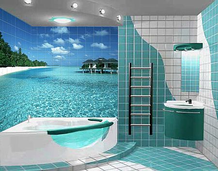 Asymmetric bathtub can be faced with special mosaic on the flexible basis and then use its remnants and for facing the frame for mirrors. In large rooms, you can veneer mosaics and the entire wall completely. And for a more realistic design, you can put on a shelf a small glass vase, in which there will be sea pebbles and shells brought from the next vacation. They can also be used to paste over the frame around the mirror, if you do not like the mosaic option.
In the design small bathrooms do not abuse a lot of blue. Better to give preference decor elements or textile. A large bath towel hung on a chrome round heated towel rail will look very stylish. After all, blue generally successfully combines with metallic. So that such an element does not seem lonely and spontaneous, support composition blue bathroom accessories and a laundry basket. You can also slightly diversify light walls by using a blue glass border around the perimeter. Even such a small element will refresh the room and create a completely different mood.
As you can see blue color is universal and perfectly manifests itself in any room. Therefore, do not be afraid to use it even in small quantities.

 7 tips for using green in the interior + photo
 6 tips for using gray in the interior + photo
 7 tips for using yellow in the interior + photo
 How to choose curtains for wallpaper: color, pattern, texture
 How to choose roller blinds for plastic windows
 6 tips for using brown in ...
 9 tips for using red in the interior + photo
 Choose wallpaper for the bedroom: material, color, pattern
 6 tips for choosing the color of interior doors
 What wallpaper to choose for the living room: view, color, pattern, style